The design-first feedback manifesto
Feedback software got bloated, ugly and extractive. Bloated with options nobody asked for, ugly because design was an afterthought, extractive because it treats voters as leads to harvest. This manifesto argues feedback deserves better, and lays out six principles for building it: public, frictionless, opinionated, well-designed, EU-hosted and honestly priced.
Feedback deserves better than this
Feedback software got bloated, ugly and extractive. Bloated with custom statuses, scoring matrices and integrations nobody asked for. Ugly because design was treated as decoration, bolted on after the database schema. Extractive because too many tools quietly treat the people leaving feedback as leads to capture, gate behind a login, and resell attention to. This is a manifesto for the opposite: feedback tools that respect the user, the visitor and the truth. Here are six principles we build on, and the honest cost of each.
1. Public by default
A roadmap that lives behind a login is a roadmap nobody reads. When you make feedback public, three things happen at once: every visitor sees that you listen, search engines index each idea and status page, and the quiet majority who would never email you can vote with a glance. Privacy as the default setting is a tax on trust. You can always keep a sensitive bet off the board, but the board itself should be open, indexable and shareable. A public roadmap is not a risk to manage. It is the cheapest credibility you will ever buy.
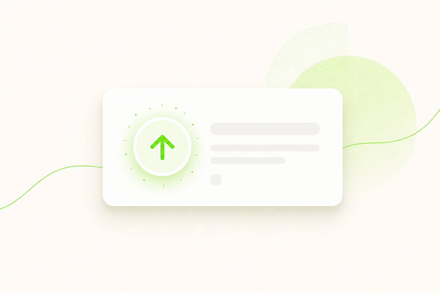
2. Voting without friction
Friction is the silent killer of feedback. Every extra field, every "create an account to continue", every password reset filters your input down to the few most stubborn users, and then you mistake that noise for signal. The pattern is well documented elsewhere: the Baymard Institute found that reducing the number of form fields lifts completion, and the same physics governs a vote. We use magic-link voting: one email, one tap, one vote, no account and no password. If you want the full argument for why login walls bias your roadmap, read feature voting without login. A vote you make people work for is a vote you will not receive.
3. Opinionated, not configurable
Most tools mistake configurability for power. They hand you a maze of custom statuses, workflow stages, tags and scoring fields, and call it flexibility. What it actually buys you is setup fatigue and a board your own users cannot parse. We ship exactly three statuses: planned, in progress, shipped. That is not a limitation we apologize for, it is the product. Constraints are a feature, because they make the default outcome a good outcome. The honest cost is real: if your process genuinely needs a fourth column, we are the wrong tool, and we would rather tell you that than bloat the product to keep you.
4. Design is respect
An ugly feedback board is a message, and the message is "we did not care enough to make this nice." Users read that instantly, even when they cannot name it. Design is not the paint you add at the end; it is whether the page loads fast, whether the type is legible, whether a vote feels satisfying instead of like filing a ticket. This matters more than feature lists, because feature lists do not predict whether anyone will actually engage. Most software is justified by features that go unused anyway: Pendo found that 80% of features in the average product are rarely or never used, and the Standish Group's research put it at 64%. Polish, by contrast, is used every single time someone looks at your board.
5. Your data stays in Europe
Privacy is not a premium feature to upsell, and it should not be a tax. When a tool is hosted overseas and routes your voters' emails through someone else's jurisdiction, you inherit the legal exposure and your users inherit the risk. We host in the EU, GDPR-native, because the people leaving you feedback did not consent to becoming someone's data export. This is not a checkbox on a pricing page. It is a default that should cost nothing extra, because respecting where your users' data lives is the baseline, not the upgrade.
6. Honest, flat pricing
Most feedback tools punish you for succeeding. The dominant model charges per seat or per tracked user, so the more your product grows and the more feedback you collect, the more you pay, often without using a single new feature. Here is the honest pattern across the category:
| Pricing model | What you actually pay for | What happens as you grow |
|---|---|---|
| Per tracked user | Each end user who interacts | Cost climbs with your success |
| Per seat / per maker | Each internal teammate | Inviting colleagues gets expensive |
| Per board | Each roadmap you run | Splitting topics costs extra |
| Flat (our model) | The product, once | Price stays put as you scale |
We charge one flat price: 9 EUR per month, everything included, no per-seat and no per-voter math, ever. Unlimited boards, unlimited voters, unlimited admins. Pricing is a values statement. A bill that grows every time you listen to more users is a bill designed to discourage listening.
The honest trade-off
None of this is free. Doing less means saying no, often to reasonable requests from people we would love to keep. The opinionated three-status board will not fit every workflow. The flat plan will not undercut a free tier, because we do not have one. Choosing simplicity is choosing to disappoint the teams who genuinely want more knobs, and we accept that. What we will not do is bloat the product, gate the voting, hide the cost, or pretend that more options equal more value. If you are comparing the field, our alternatives page lays the choices out plainly.
Build feedback that respects the people giving it. Make it public so they are heard, frictionless so they bother, beautiful so they feel cared for, and honestly priced so listening never costs you more. That is the whole manifesto.
FAQ
- What does "design-first feedback" actually mean?
- It means treating the feedback experience as a product, not a form. The board your users see should be fast, clear and pleasant, voting should take one tap, and the defaults should be opinionated so nobody has to configure their way to a good result.
- Why is making users create an account to vote a problem?
- Every field and every login wall measurably lowers participation. An account requirement filters your feedback down to the most motivated few, which biases your roadmap and hides the quiet majority. Magic-link voting removes the wall entirely: one email, one tap, one vote.
- Does doing less actually help a feedback tool?
- Yes, with an honest trade-off. Fewer features means saying no to legitimate requests, and some teams will need an option we do not offer. In exchange, everyone gets a board that is faster to set up, easier to read, and impossible to misconfigure.